Mastercard Connect
I led the design of making the Contacts search and maintenance experience in Mastercard Connect easier and more streamlined.
Presented project to senior leadership and designs will be considered as part of the roadmap and influence the upcoming revamp of Mastercard Connect.
Role
Design Lead
Duration
Feb - May, 2022
Team

Jeffrey Shen
Designer

Alysa Liu
Designer

Jirachaya Kiriruangchai
Designer

Andrea Juwono
PM
Context
Mastercard Connect (MC) is where Mastercard's customers, like large banks, come to manage their business. A birthright feature of MC is My Company Manager (MCM), which allows users to manage everything pertaining to their company. Contacts is one of those features. It stores all of a company's internal and external contacts.
Problem
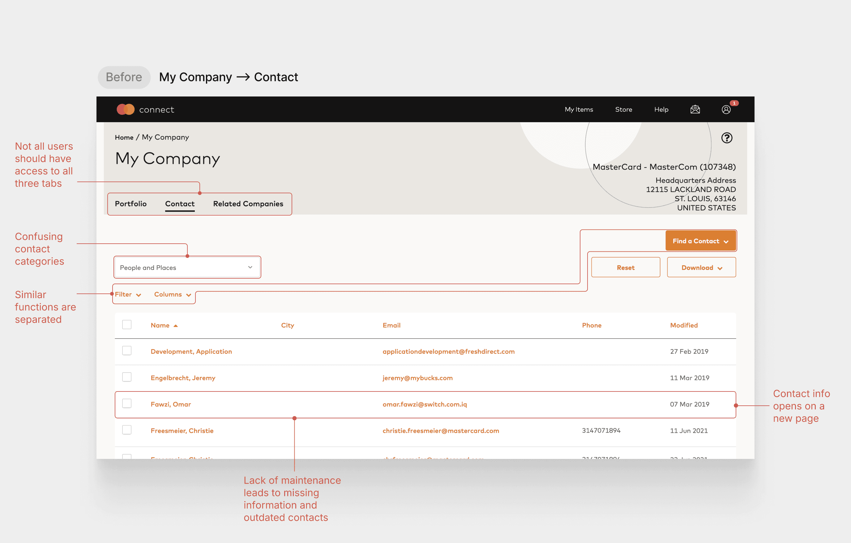
According to our research, >50% of user-mentioned issues in MCM are linked to the Contacts feature. Contacts is extremely confusing to use, tedious to update, and potentially at risk of security issues.
Goal
Make searching and maintaining contacts easier, faster, and more flexible, while ensuring the security of confidential information.
Success Metrics
1
Reduce time it takes to Contacts page
Minimize the number of clicks to find and navigate to the Contacts page
2
Reduce contact update time
Minimize clicks and clarify instructions on how to update contacts
3
Reduce time to search contacts
Make the search, filter, and sort features more accessible and flexible
4
Increase number of updated contacts
Help financial institutions have more updated contacts to work more effectively
Final Solution
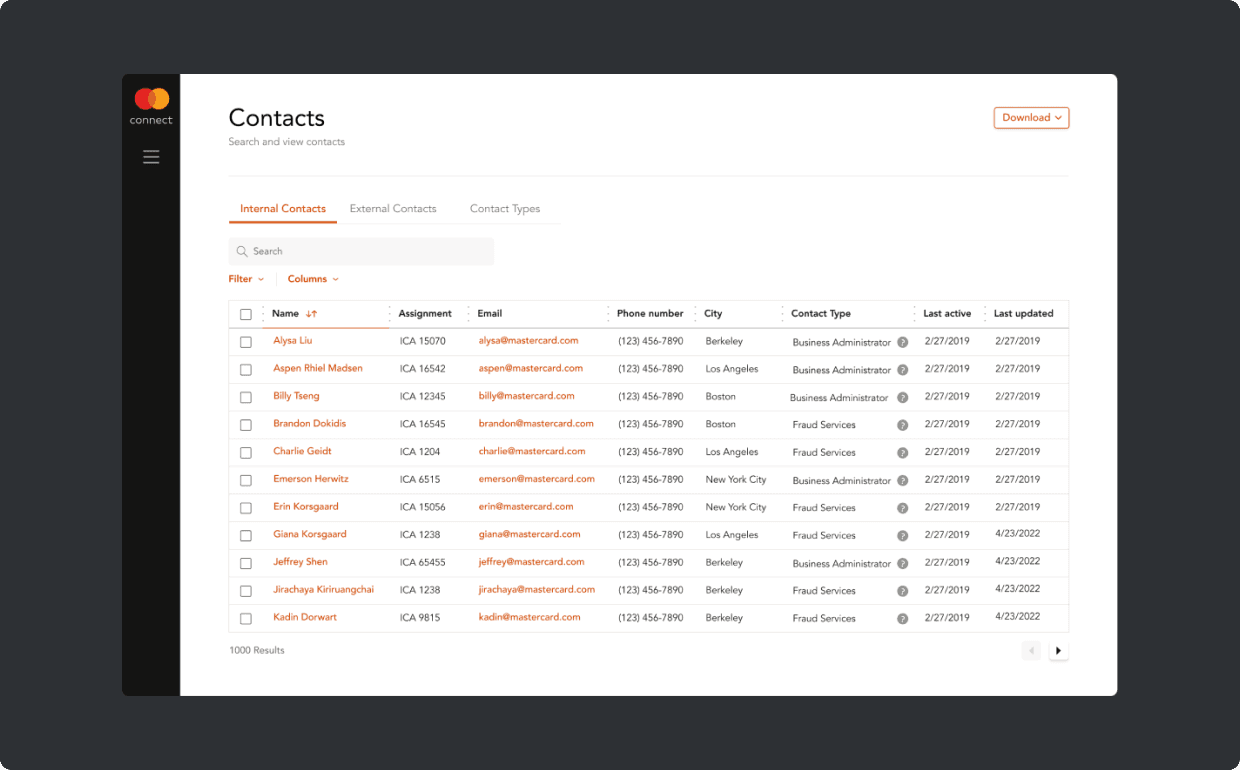
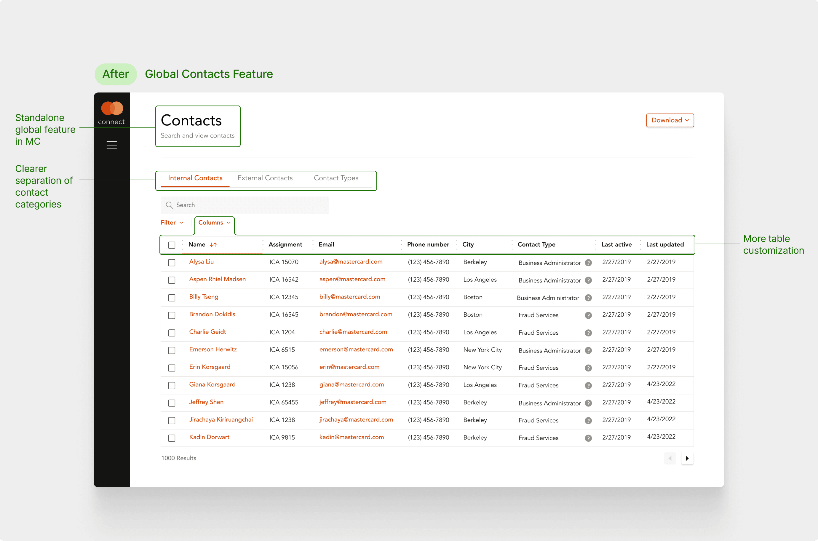
Contacts is now a global feature, accessible from anywhere in MC. It now has a more elevated feel consistent with the rest of the platform, along with a clearer maintenance process and a more flexible search experience.
Research
The initial problem we set out to solve was around the navigation scheme of Mastercard Connect (MC) and My Company Manager (MCM). However, our research showed the problem was more specifically in the Contacts page.
1
No maintenance = outdated contacts
The difficult nature of maintaining contacts, specifically finding who/what to update, prevents admins from updating the list.
2
Confusing and risky location
The current Contacts location is confusing and brings up security concerns since it's grouped with confidential information.
3
Rigid search structure
The lack of flexibility in the table, search, and filter function makes it hard for users to find the contacts they need easily and quickly.
4
Contact info lacks context
When viewing more info about a contact, users are brought to a new page, which removes them from the overarching context.
Challenge 1: Maintenance
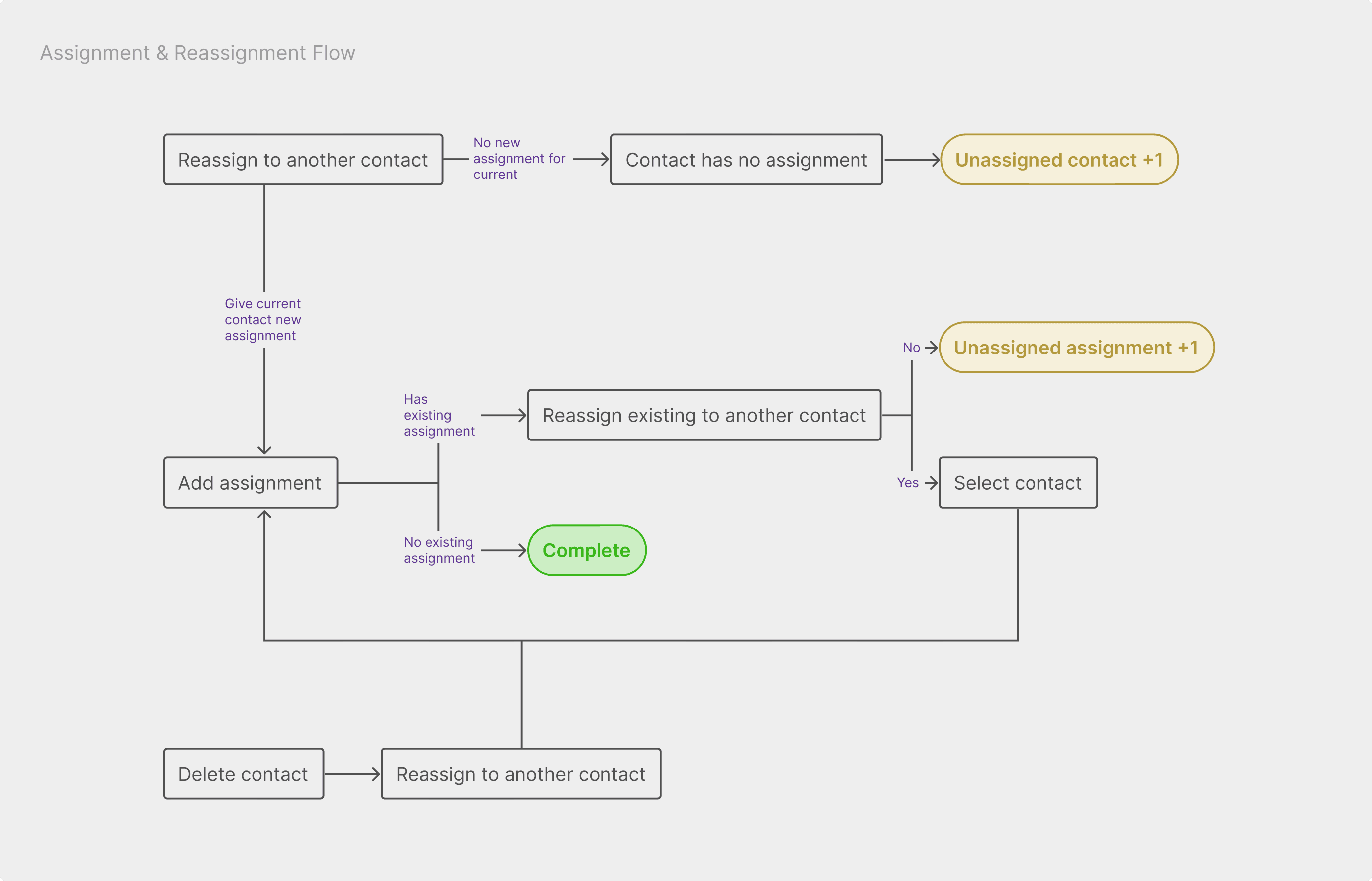
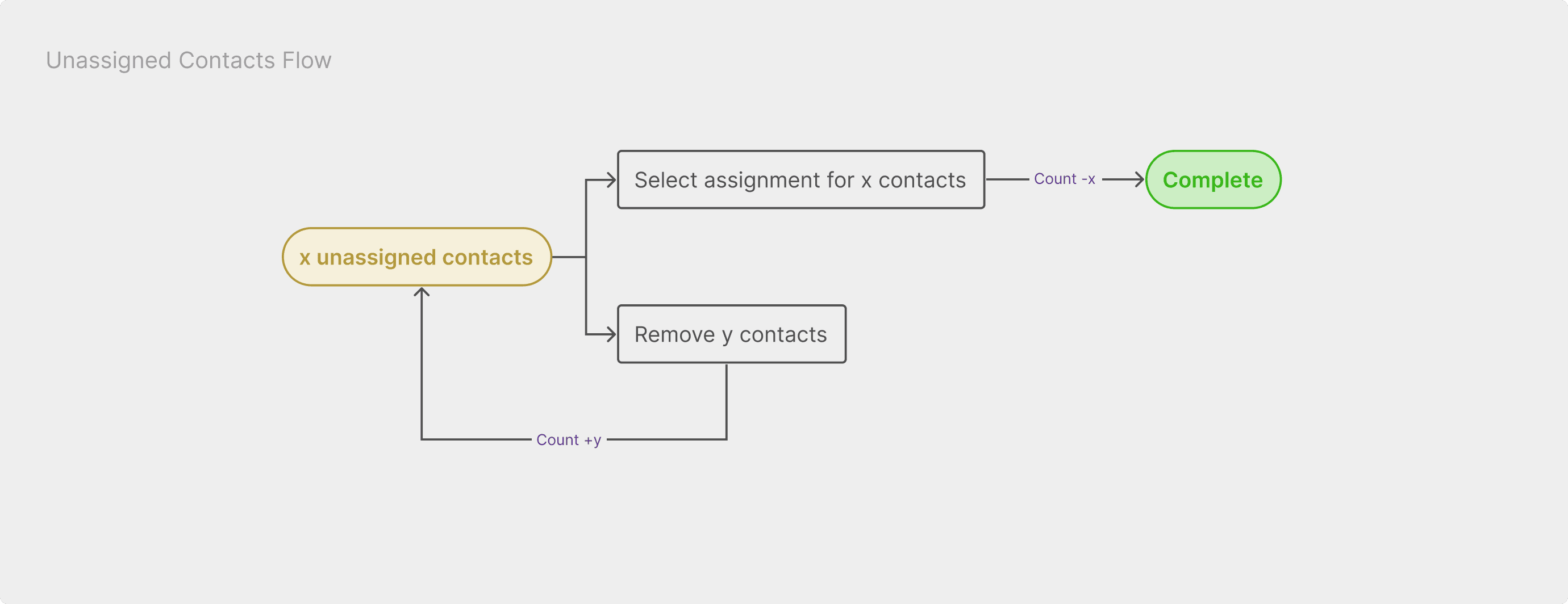
How might we make updating and managing contacts easier? Our answer: proactively surface opportunities to update contacts. I added alerts that prompt users to amend unassigned contacts, while promoting reassignment when deleting contacts.
Challenge 2: Search
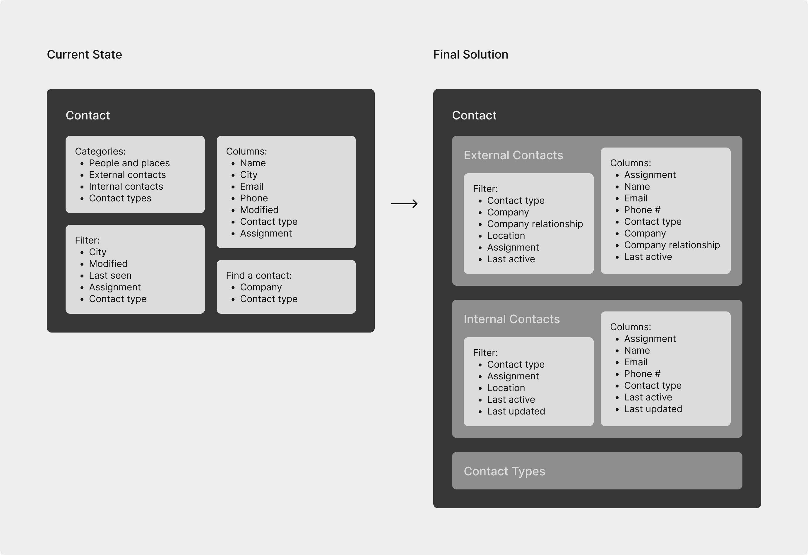
How might we make search more flexible and clear? Our answer: creating a clearer categorization in filters to help users make faster and more intuitive choices. I separated Contacts into three tabs to help users navigate more intuitively between different contacts and created specific filters for each to help user better delineate them.
Final Design: Global Nav + Search
Users can now navigate to the Contacts page from anywhere and search or filter by any attribute associated with a contact in the context they need.
Final Design: Contacts Maintenance
Admins now have a clearer idea of what to update when they land on the Contacts page and with a few clicks, they can easily and quickly update contacts.
Final Design: Contact Information
When clicking into contacts, users will be shown a modal that maintains the overall context, while providing the admin with actions they can complete, such as reassigning a contact.
Outcomes
1
Influenced project roadmap
The designs will influence the revamp of MC, giving users more control and security as they navigate and use Contacts
2
Saved searching and updating time
Rudimentary user testing has shown that our designs can help users save time in searching for and updating contacts
3
Pivot direction based on research
Our research on the gave us confidence to propose to Mastercard a pivot from global navigation to the Contacts page
Takeaways
Our team realized the real problem, which deviated from the initial problem given, and gathered all our insights and convinced the Mastercard team to pivot direction. Don’t be afraid to propose a pivot or make a change if you have the evidence for it. Because of our efforts, we were able to better advocate for the users and create a solution that truly caters to their needs.
Check out my work with Momo

Mastercard Connect
I led the design of making the Contacts search and maintenance experience in Mastercard Connect easier and more streamlined.
Presented project to senior leadership and designs will be considered as part of the roadmap and influence the upcoming revamp of Mastercard Connect.
Role
Design Lead
Duration
Feb - May, 2022
Team

Jeffrey Shen
Designer

Alysa Liu
Designer

Jirachaya Kiriruangchai
Designer

Andrea Juwono
PM

Context
Mastercard Connect (MC) is where Mastercard's customers, like large banks, come to manage their business. A birthright feature of MC is My Company Manager (MCM), which allows users to manage everything pertaining to their company. Contacts is one of those features. It stores all of a company's internal and external contacts.
Problem
According to our research, >50% of user-mentioned issues in MCM are linked to the Contacts feature. Contacts is extremely confusing to use, tedious to update, and potentially at risk of security issues.

Goal
Make searching and maintaining contacts easier, faster, and more flexible, while ensuring the security of confidential information.
Success Metrics
1
Reduce time it takes to Contacts page
Minimize the number of clicks to find and navigate to the Contacts page
2
Reduce contact update time
Minimize clicks and clarify instructions on how to update contacts
3
Reduce time to search contacts
Make the search, filter, and sort features more accessible and flexible
4
Increase number of updated contacts
Help financial institutions have more updated contacts to work more effectively
Final Solution
Contacts is now a global feature, accessible from anywhere in MC. It now has a more elevated feel consistent with the rest of the platform, along with a clearer maintenance process and a more flexible search experience.

Research
The initial problem we set out to solve was around the navigation scheme of Mastercard Connect (MC) and My Company Manager (MCM). However, our research showed the problem was more specifically in the Contacts page.
1
No maintenance = outdated contacts
The difficult nature of maintaining contacts, specifically finding who/what to update, prevents admins from updating the list.
2
Confusing and risky location
The current Contacts location is confusing and brings up security concerns since it's grouped with confidential information.
3
Rigid search structure
The lack of flexibility in the table, search, and filter function makes it hard for users to find the contacts they need easily and quickly.
4
Contact info lacks context
When viewing more info about a contact, users are brought to a new page, which removes them from the overarching context.
Challenge 1: Maintenance
How might we make updating and managing contacts easier? Our answer: proactively surface opportunities to update contacts. I added alerts that prompt users to amend unassigned contacts, while promoting reassignment when deleting contacts.


Challenge 2: Search
How might we make search more flexible and clear? Our answer: creating a clearer categorization in filters to help users make faster and more intuitive choices. I separated Contacts into three tabs to help users navigate more intuitively between different contacts and created specific filters for each to help user better delineate them.

Final Design: Global Nav + Search
Users can now navigate to the Contacts page from anywhere and search or filter by any attribute associated with a contact in the context they need.
Final Design: Contacts Maintenance
Admins now have a clearer idea of what to update when they land on the Contacts page and with a few clicks, they can easily and quickly update contacts.
Final Design: Contact Information
When clicking into contacts, users will be shown a modal that maintains the overall context, while providing the admin with actions they can complete, such as reassigning a contact.
Outcomes
1
Influenced project roadmap
The designs will influence the revamp of MC, giving users more control and security as they navigate and use Contacts
2
Saved searching and updating time
Rudimentary user testing has shown that our designs can help users save time in searching for and updating contacts
3
Pivot direction based on research
Our research on the gave us confidence to propose to Mastercard a pivot from global navigation to the Contacts page
Takeaways
Our team realized the real problem, which deviated from the initial problem given, and gathered all our insights and convinced the Mastercard team to pivot direction. Don’t be afraid to propose a pivot or make a change if you have the evidence for it. Because of our efforts, we were able to better advocate for the users and create a solution that truly caters to their needs.
Check out my work with Momo

Mastercard Connect
I led the design of making the Contacts search and maintenance experience in Mastercard Connect easier and more streamlined.
Presented project to senior leadership and designs will be considered as part of the roadmap and influence the upcoming revamp of Mastercard Connect.
Role
Design Lead
Duration
Feb - May, 2022
Team

Jeffrey Shen
Designer

Alysa Liu
Designer

Jirachaya Kiriruangchai
Designer

Andrea Juwono
PM

Context
Mastercard Connect (MC) is where Mastercard's customers, like large banks, come to manage their business. A birthright feature of MC is My Company Manager (MCM), which allows users to manage everything pertaining to their company. Contacts is one of those features. It stores all of a company's internal and external contacts.
Problem
According to our research, >50% of user-mentioned issues in MCM are linked to the Contacts feature. Contacts is extremely confusing to use, tedious to update, and potentially at risk of security issues.

Goal
Make searching and maintaining contacts easier, faster, and more flexible, while ensuring the security of confidential information.
Success Metrics
1
Reduce time it takes to Contacts page
Minimize the number of clicks to find and navigate to the Contacts page
2
Reduce contact update time
Minimize clicks and clarify instructions on how to update contacts
3
Reduce time to search contacts
Make the search, filter, and sort features more accessible and flexible
4
Increase number of updated contacts
Help financial institutions have more updated contacts to work more effectively
Final Solution
Contacts is now a global feature, accessible from anywhere in MC. It now has a more elevated feel consistent with the rest of the platform, along with a clearer maintenance process and a more flexible search experience.

Research
The initial problem we set out to solve was around the navigation scheme of Mastercard Connect (MC) and My Company Manager (MCM). However, our research showed the problem was more specifically in the Contacts page.
1
No maintenance = outdated contacts
The difficult nature of maintaining contacts, specifically finding who/what to update, prevents admins from updating the list.
2
Confusing and risky location
The current Contacts location is confusing and brings up security concerns since it's grouped with confidential information.
3
Rigid search structure
The lack of flexibility in the table, search, and filter function makes it hard for users to find the contacts they need easily and quickly.
4
Contact info lacks context
When viewing more info about a contact, users are brought to a new page, which removes them from the overarching context.
Challenge 1: Maintenance
How might we make updating and managing contacts easier? Our answer: proactively surface opportunities to update contacts. I added alerts that prompt users to amend unassigned contacts, while promoting reassignment when deleting contacts.


Challenge 2: Search
How might we make search more flexible and clear? Our answer: creating a clearer categorization in filters to help users make faster and more intuitive choices. I separated Contacts into three tabs to help users navigate more intuitively between different contacts and created specific filters for each to help user better delineate them.

Final Design: Global Nav + Search
Users can now navigate to the Contacts page from anywhere and search or filter by any attribute associated with a contact in the context they need.
Final Design: Contacts Maintenance
Admins now have a clearer idea of what to update when they land on the Contacts page and with a few clicks, they can easily and quickly update contacts.
Final Design: Contact Information
When clicking into contacts, users will be shown a modal that maintains the overall context, while providing the admin with actions they can complete, such as reassigning a contact.
Outcomes
1
Influenced project roadmap
The designs will influence the revamp of MC, giving users more control and security as they navigate and use Contacts
2
Saved searching and updating time
Rudimentary user testing has shown that our designs can help users save time in searching for and updating contacts
3
Pivot direction based on research
Our research on the gave us confidence to propose to Mastercard a pivot from global navigation to the Contacts page
Takeaways
Our team realized the real problem, which deviated from the initial problem given, and gathered all our insights and convinced the Mastercard team to pivot direction. Don’t be afraid to propose a pivot or make a change if you have the evidence for it. Because of our efforts, we were able to better advocate for the users and create a solution that truly caters to their needs.
Check out my work with Momo

